6 proven ways to an inclusive input

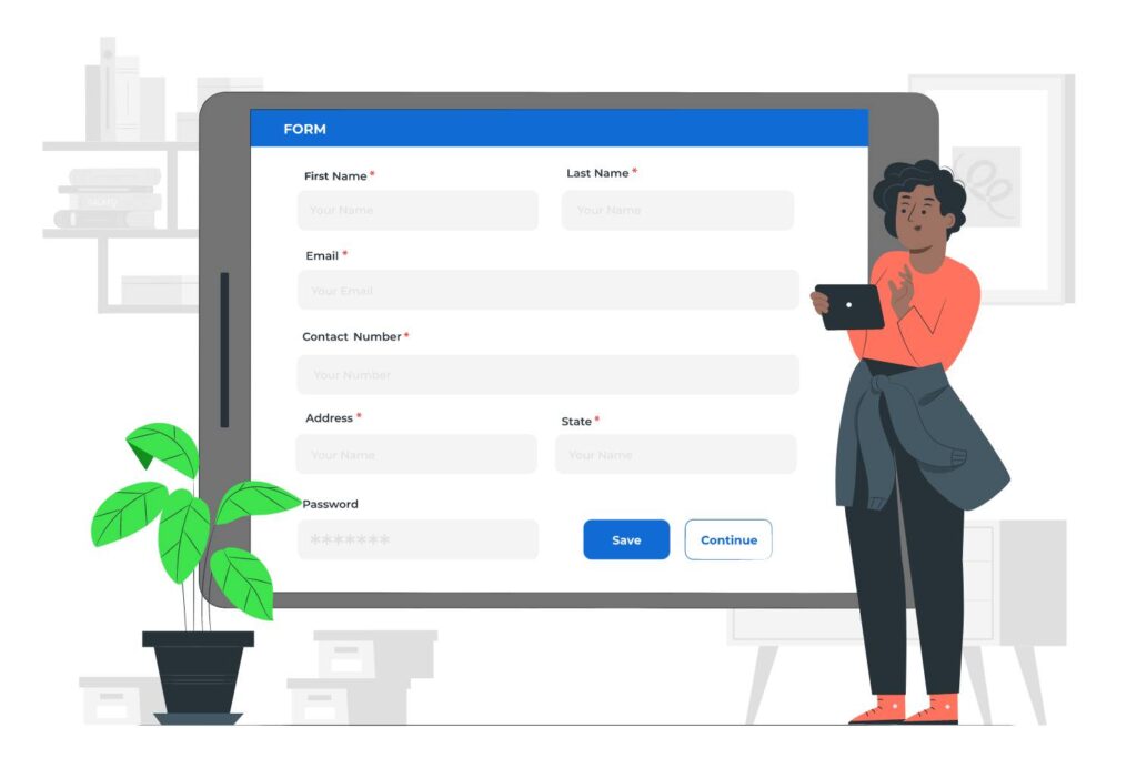
Forms are a fantastic way to enhance the connection between you and your customers, while also gaining a better understanding of their needs. However, it’s important that every customer can utilize the input in that form. By creating an inclusive form, you eliminate any potential barriers and provide equal access to all your customers. Let’s review how you can boost your customer engagement by making sure your forms are inclusive.
1. Test your color contrast
Start by reviewing the colors you’ve used for your form inputs. To do this, test the color contrast between the text color and the background color. You’ll need to meet a minimum contrast ratio of 4.5:1. Follow the instructions provided in The essential guide to inclusive font, and use the WebAim tool to test your contrast ratio. Make sure you test the input label, placeholder, and error message.

Don’t forget to test the color contrast of your input’s border and focus border. The borders only need to meet a minimum contrast ratio of 3:1.
2. Add labels
Labels associated with form inputs play an important role. They inform your customer what information you’d like them to enter in that input. To do this, use the trusty <label> element. The label’s for attribute will connect to the input’s id.
<label for="fname">First name:</label><br>
<input type="text" id="fname" name="fname" placeholder="Enter your first name">
Having a placeholder is a great way to provide more information to your customers. However, screen readers CAN’T read placeholders. Therefore it’s important that you provide a label and connect it to your input.
3. Identify what’s required
If you need the customer to fill out that input, make sure you identify them as required. It creates a poor experience for your customer if you force your customer to submit your form before they realize which fields are required. The better approach is to inform your customer what they need to fill in. A great way to inform which fields are necessary is by adding the required attribute and adding an asterisk to the required field.
<label for="fname">First name: *</label><br>
<input type="text" id="fname" name="fname" placeholder="Enter your first name" required>
4. Help with Error Messaging
Oops! We all make mistakes, and that’s why it’s important to provide clear and friendly error messages. To make sure your error message is inclusive, it’s important to connect the error message to the input that has the error. To do this, you’ll need two attributes; aria-invalid and aria-describedby. The dynamic attribute aria-invalid is true when the input has an error (aria-invalid=”true”). The aria-describedby connects your error message to your input’s id.
<label for="fname">First name: *</label><br />
<input type="text" id="fname" name="fname" placeholder="Enter your first name" aria-describedBy="error1" aria-invalid="true" required /><br />
<span class="errtext" id="error1">Your name must have at least 3 characters</span>
5. Navigate with ease
Let’s not forget about our keyboard-only users. Make sure that your inputs can be easily navigated only your keyboard. Your customers will you the TAB key to get to your inputs. Make sure the TAB order follows the visual order. By providing effortless keyboard navigation, you’re making your forms accessible to all.
6. Test your input
Finally, test your form inputs. Put yourself in the shoes of customers who rely on screen readers, keyboard-only navigation, and other accessibility tools. Regular testing and user feedback will help you identify any potential barriers or usability issues.
Conclusion
By making your form inputs accessible, you’re making your website more inclusive and welcoming to everyone. By considering color contrast, labels, showing what’s required, error handling, keyboard navigation, and testing with assistive technologies, you can ensure all your customers can fill out your forms with ease. Let’s work together to make the web a more accessible and inclusive place for everyone!


