Accessible accordions: A quick guide
Welcome back, everyone!
I’m excited to share another tip to help you make your website more inclusive. Today, we’re diving into the world of accordions—a fantastic tool for managing large text content on your website. You’ll often see them used for a website’s FAQ section. In this guide, we’ll walk you through how to make them accessible for all your customers.
What’s in an accordion
Let’s break down the basic elements that make up an accordion. For the purposes of this post, we’ll call the clickable elements that show and hide content “headings”. The content that will be shown or hidden is referred to as “hidden content”.
The headings must be a clickable element, such as a <button>.
The hidden content can include anything that takes up a good amount of room and looks cleaner when hidden. For this example, I’ll use a paragraph with text.
Basic code structure for accordions
<h3>
  <button>Heading</button>
</h3>
<p>Lorem ipsum dolor sit amet, consectetuer adipiscing elit. Aenean commodo ligula eget dolor. Aenean massa. Cum sociis natoque penatibus et magnis dis parturient montes, nascetur ridiculus mus.</p>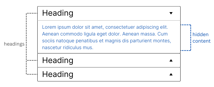
Making accordions accessible
Let’s go through the key points to consider:
ARIA attributes for accordions
Now, let’s add the attributes to make the accordion accessible:
aria-controls: Add this to the button to connect it to the container with the hidden content. Make sure to use the same name on theidof the container holding the hidden content. In our example, we use the name “my-section”.aria-expanded: This dynamic attribute identifies the current state of the corresponding expandable hidden content. The attribute istruewhen expanded (aria-expanded="true") andfalsewhen collapsed (aria-expanded="false").aria-hidden: Add this dynamic attribute to the hidden content container. It should betruewhen the content is hidden (aria-hidden="true"), keeping it out of sight (and out of mind) for screen readers. When the accordion expands, set this attribute tofalse(aria-hidden="false").
<h3>
  <button aria-expanded="false" aria-controls="my-section">Heading</button>
</h3>
<p id="my-section" aria-hidden="true">Lorem ipsum dolor sit amet, consectetuer adipiscing elit. Aenean commodo ligula eget dolor. Aenean massa. Cum sociis natoque penatibus et magnis dis parturient montes, nascetur ridiculus mus.</p>
Keyboard accessibility for accordions
Make sure your customers can navigate and interact with your accordion using just a keyboard.
- The TAB key moves the focus from one header to the next. Customers should be able to press ENTER or SPACEBAR to toggle the accordion open or closed—because, let’s be honest, who doesn’t enjoy pressing a good button?
Clear focus state
Make sure the button or header has a visible focus state. It’s important that your customers can see which header is currently focused on when navigating via keyboard. If you need more tips on focus states, check out my previous post, “Unlocking the power of the focus state“.
Readable text in accordions
We also want to make sure that our content can be easily read. Choose fonts that are simple and ensure good contrast between the text and background. For more on this, take a look at “The essential guide to inclusive font“.
Common pitfalls to avoid with accordions
Even with the best of intentions, it’s easy to make mistakes when implementing accordions. Here are a couple of common ones to watch out for:
- Focus in your hidden content: If you have a focusable element, like a link, inside your hidden content, your customers should be able to TAB to it when the accordion is expanded. No one likes a hidden surprise they can’t reach!
- Accordion images and screen readers: You might use images like down/up arrows to show the state of the accordion. However, these images can confuse screen reader users if they’re labeled as ‘open’ or ‘closed’ or have no alt text at all. Instead, use
aria-hidden="true"to hide these images from screen readers. Remember, thearia-expandedattribute already tells screen readers the current state.
Conclusion
Accordions are a great way to clean up a page with a lot of information—compact yet incredibly powerful. By following these best practices, you ensure that your accordions are not just functional but also welcoming to everyone. As always, accessibility isn’t just a box to check; it’s a way to make sure all customers can fully experience what your website has to offer.
Stay tuned for more tips, and happy coding!