Adding text over irregular backgrounds: A simple guide

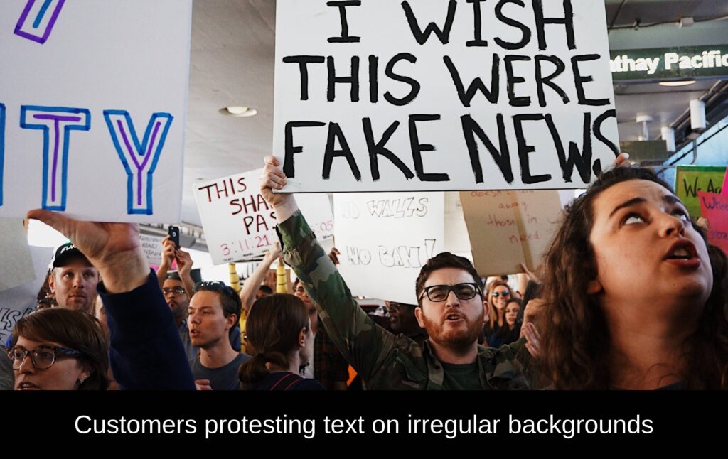
Adding text over images or videos is important for creators, marketers, and social media users. But when the background is irregular, like a busy image, colorful backgrounds, or dynamic video, it can be tricky to make the text meet WCAG’s color contrast ratio without ruining the overall look. In “The essential guide to inclusive font” we touched on the subject of adding text over irregular backgrounds. But let’s dive deeper into this subject to see what avenues we can take to make your content inclusive to all customers. In this guide, you’ll learn how to add text over irregular backgrounds, helping you create amazing visuals that catch attention and deliver your message effectively, while still meeting WCAG’s minimum contrast ratio. Let’s get started!
Choose the right font style and color
Picking the right text and font is important for making sure people can read your text and that it looks good with the background. Here are some tips:
- Use fonts that are easy to read no matter the size you use. Keeping it simple!
- Choose a font style that goes well with the mood and theme of your content.
- Try different font colors to find the best contrast with your background.

Remember, all your text needs to meet WCAG’s minimum color contrast. When dealing with gradient backgrounds, testing color contrast becomes a bit trickier. Here's what you need to do: test the lightest and darkest colors of the gradient surrounding your text against the text color.
Decide where to put the text
Finding the right place for your text is crucial so that you have sufficient contrast to the background. Follow these tips:
- Look for areas with a solid color or empty spaces where the text can stand out.
- Use grids or tools that help you line up your text neatly in every screen size.
- Consider how much text to include. Your statement may take up more space in other languages.


Create contrast
To make your text stand out, you need to have sufficient contrast from your irregular background. Here’s how:
- Avoid adding text on backgrounds with too many colors.
- Add an additional opacity layer between the text and your irregular background to make it easier to read.
- If an opacity layer won’t do, try adding a border or outer shadow to your text to meet minimum color contrast.

If you're using light colored text, use a dark opacity layer. For dark text, use a light opacity layer.
Sidestep your irregular backgrounds
The safest option avoid using text over irregular backgrounds. Give these techniques a try:
- Add a container with a solid background for your text onto your image.
- Assign your text to a portion of your grid that will not overlap with your irregular background
- If all else fails, avoid using irregular backgrounds.

Conclusion
Adding text to irregular backgrounds requires some thought, but with the right approach, you can create captivating visuals that effectively convey your message. By choosing the right font style and color, placing it carefully, creating contrast, and considering simpler approaches, you’ll achieve great results. With practice and creativity, you’ll master this skill and make inclusive content for all your customers to enjoy. So, go ahead, experiment, and let your imagination run wild!


