Buttons vs Links: Making them accessible and effective
Welcome back, readers!
I’m here with another tip to make your website inclusive for all your customers. Today, let’s dive into the world of buttons and links. In a previous post, “5 secrets to inclusive buttons” I shared tips on making your buttons more accessible. Now, let’s explore <a> (links) and <button> (buttons), what they have in common, and when to use one over the other. Let’s get started!
What <a> and <button> have in common
Before we get into when to use each, let’s start with what they have in common. Both <a> and <button> play important roles in ensuring your website is user-friendly and accessible. Here are some key points they share:
- Readable Font: Both elements should use a readable font to ensure that everyone can easily read the text. Skip the fancy fonts—they’re not your best choice for accessibility. (For more tips, check out “The essential guide to inclusive fonts“)
- Contrast Ratio: Both should meet the minimum contrast ratio to make text stand out against the background. This is vital for visitors with low vision. (To test your color contrast, use this free tool from webaim)
- Mouse and Keyboard Accessibility: It’s important that both elements can be accessed via mouse and keyboard. This way, people who use a keyboard to get around can easily interact with your website.
- Keyboard Activation: People visiting your website should be able to press ENTER on their keyboard to activate both elements. Not all your visitors can use the mouse, so the keyboard is important here.
- Focus State: Both should have a clear focus state, so anyone can see which element they are interacting with, especially those who use keyboard navigation or have low vision. (See “Unlocking the power of the focus state” for more.)
Now, let’s talk about when to use each element.
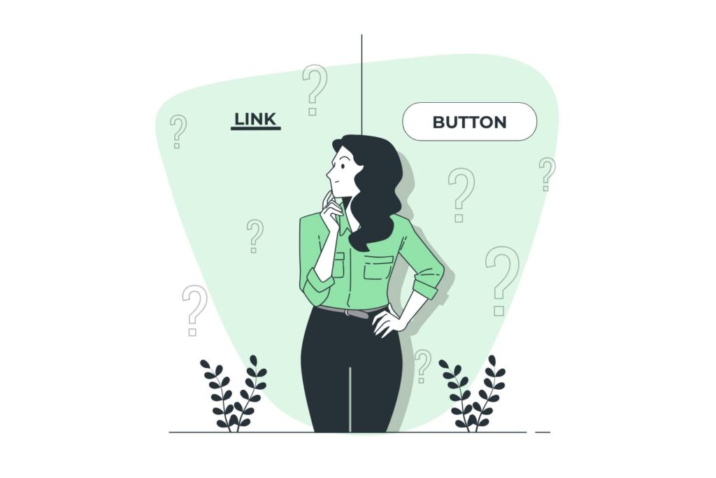
<button> vs <a>
Knowing when to use a <button> and when to use an <a> link can make a huge difference in your website’s usability and accessibility. Here’s a simple guide to help you make the right choice:
When to use a link <a>
Links are great for navigation. Here are the scenarios where an <a> link is the way to go:
- Link Appearance: Is your navigation element just text with no box around it? If so, it’s a link.
- Anchors: Are you sending your customer to a different section of the page? Anchors (
<a>) are designed for this. - Different Page: Are you sending the customer to a different page? Links are meant for navigation between pages.
- External Sites: Are you sending the customer to another website? Use a link.
If you answered “yes” to any of these questions, you should probably use an <a> link. Links are meant to navigate users, whether within the same page, different pages, or entirely different websites.
When to use buttons <button>
Buttons are action-oriented. Here’s when you should opt for a <button>:
- Button Appearance: Does it look like a button? If it looks like a button and presses like a button, it’s a button.
- Action-Oriented: Are you asking the customer to perform an action, such as “Download,” “Sign up,” or “Log out”? Buttons are perfect for triggering actions.
- Trigger Functions: Will entering or clicking on the button trigger a function on the page, like playing a video or opening a modal? This is a job for a
<button>.
If you answered “yes” to any of these questions, a <button> button is your best bet. Buttons are designed for actions, making them the right choice for interactions beyond simple navigation.
Common mistakes to avoid
Even with the best intentions, it’s easy to make mistakes. Let’s talk about a couple of common pitfalls:
Title attribute in links
I’ve seen websites where the title attribute is added to a link with the same text as the link itself. This can annoy your screen reader customers, as it adds repetitive information. The title attribute should provide additional information, such as the title of the destination or the type of content at the destination.
Links without context
Many websites use “learn more” or “read more” buttons after a preview of an article or post. For those folks that rely on screen readers, it’s unclear which article each “read more” button belongs to. To provide more context, use an off-screen <span> or an aria-label. This way, each button gives more information about what your reader will learn or read more about, so they can make informed decisions.
Conclusion
Buttons and links are like the essential tools in your web design toolbox. Understanding when to use each one is key to making your website welcoming to everyone. When you apply these best practices, you ensure that everyone, regardless of their abilities, can easily explore and interact with your website.
Now that you’ve got the hang of buttons and links, go ahead and enhance your website’s inclusivity for everyone. Stay tuned for more tips, and happy coding!