Making inclusive toggles: A path to accessibility
Welcome readers, today, we’re tackling toggles and how to make them inclusive. Toggles may seem simple at first glance, but ensuring they’re inclusive requires attention to detail in markup, design, and behavior. So, let’s dive in and learn how to create toggles that everyone can use and enjoy.
Two options, one decision
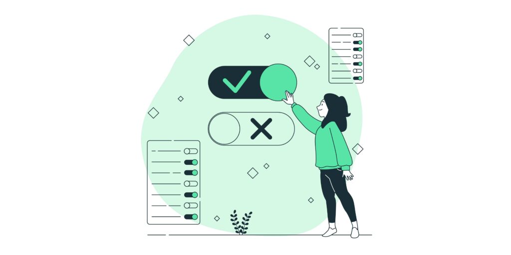
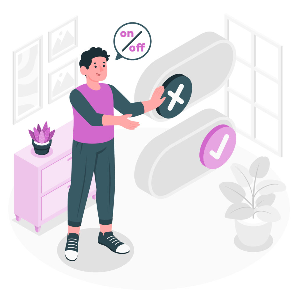
When it comes to toggles, simplicity is key. Customers should have a straightforward choice between two options: “on” or “off”, or “yes” or “no.” What matters most is giving your customers a clear binary decision.
Building your toggle
Let’s start with a simple example: asking customers if they’d like to be notified by email. We’ll include text asking about email notification and copy for the two choices. You can use CSS or JavaScript to toggle between showing “Email me” or “No emails” text based on the toggle’s current state, to make clear to your customer which choice they’ve made.
Note: I’ve hidden the aria-hidden to ensure screen readers don’t get repetitive information that will be captured using the aria-checked attribute.
<button type="button">
	<span class="label">Notify by email?</span>
	<span class="on" aria-hidden="true">Email me</span>
	<span class="off" aria-hidden="true">No emails</span>
</button>
It’s preferred and highly recommended to wrap your toggle in a <button> element. This automatically makes the toggle keyboard accessible. If you choose to use a <div>, make sure your toggle is keyboard accessible, which we’ll cover shortly.
Adding a role
To make sure our toggle is identifiable, especially for screen reader users, we add role="switch".
<button type="button" role="switch">
  <span class="label">Notify by email?</span>
  <span class="on" aria-hidden="true">Email me</span>
  <span class="off" aria-hidden="true">No emails</span>
</button>
Here’s the <div> version:
<div role="switch" tabindex="0">
  <span class="label">Notify by email?</span>
  <span class="on" aria-hidden="true">Email me</span>
  <span class="off" aria-hidden="true">No emails</span>
</div>
Is it checked?
We need a dynamic attribute to announce the toggle’s state. Enter aria-checked Ensure this attribute reflects the toggle’s current state with a value of true for “on” and false for “off”.
<button type="button" role="switch" aria-checked="false">
  <span class="label">Notify by email?</span>
  <span class="on" aria-hidden="true">Email me</span>
  <span class="off" aria-hidden="true">No emails</span>
</button>
For the <div> version:
<div role="switch" aria-checked="false" tabindex="0">
  <span class="label">Notify by email?</span>
  <span class="on" aria-hidden="true">Email me</span>
  <span class="off" aria-hidden="true">No emails</span>
</div>
Style your toggle
Ensure your toggle meets color contrast requirements. The toggle itself should have a 3:1 contrast ratio, while surrounding text needs a 4.5:1 ratio. Test your colors on WebAim to ensure accessibility.
Avoiding Color Dependency
Don’t solely rely on color to communicate the toggle’s state. Use text that reflects current state of your toggle to avoid confusion. In our example, we’re showing either “Email me” or “No emails” to make it clear.
Keyboard behavior
For customers navigating via keyboard, ensure your toggle behaves as your keyboard customer would expected.
TAB
Customers should be able to navigate to the toggle using the TAB key. Press TAB to move forward and Shift + TAB to move backward.
Space or Enter key
Both the Space and Enter keys should toggle the switch between “on” and “off” states when the toggle is focused.
Conclusion
As we conclude our journey through accessible toggles, let’s review what we’ve learned. By ensuring our toggles have the right roles, attributes, and accessibility features, we create digital experiences that welcome and empower all customers. Let’s continue building a more inclusive web together.