Navigating carousels with accessibility in mind

Have you ever found yourself on a website with those nifty little carousels? Companies use those handy slideshows to efficiently pack tons of content into a compact space. They are generally used to showcase products, images, and information without cluttering up the entire webpage. But here’s the kicker: many carousels out there aren’t as user-friendly as they could be, excluding many potential customers.
In this blog post, we’re going to delve into the world of carousels and discuss some common mistakes that can make them challenging for customers visiting your website. But fear not! We’ll also equip you with the knowledge to create carousels that everyone can enjoy.
Auto-playing Carousels: Not Everyone Reads at the Same Speed
Picture this: you’re reading a gripping book, and someone else is flipping the pages for you, sometimes too quickly and at other times, frustratingly slowly. Annoying, right? Well, auto-playing carousels can feel a bit like that. They don’t let users read at their own pace. If they’re too slow, you risk losing your audience’s interest, and if they’re too fast, readers can’t keep up. Moreover, individuals who rely on assistive technology may find it challenging to control the speed.
How to Make It Better
To address this, avoid setting your carousel to play automatically. Let your visitors take the driver’s seat and decide when they’re ready to move to the next slide. It’s all about giving them the control they deserve.
Navigation Buttons: Can You Find Them?
Those tiny carousel arrows are like trusty navigation beacons, guiding users from one slide to the next. However, there’s a catch – sometimes, they’re sneaky and hard to spot. Some arrows hide in front of images, making them a game of hide-and-seek. Others only reveal themselves when you hover your mouse over the carousel. These design choices can be frustrating for users.
How to Make It Better
Ensure your navigation buttons don’t overlap with any part of your images. They should be clearly visible and easy to click, enhancing the user experience. Ideally, it’s great to give your navigation buttons some breathing space from the information on your carousel. This way, users can easily spot these helpers. A clear path makes for happy users.

Color Contrast: Making Things Easier to See

Now, let’s talk about colors. Sometimes, carousels use color combinations that lack contrast, making it a struggle for users to read the information. When content is hard to see, it’s a recipe for frustration and might even send your visitors packing.
How to Make It Better
Maintain sufficient contrast in all the colors within your carousel. This ensures that everything stands out clearly, making it accessible to everyone. Interactive elements should meet a minimum 3:1 contrast level, while your text should aim for at least a 4.5:1 contrast level. Dive deeper into this topic by reading “The Essential Guide to Inclusive Fonts” and “Adding Text over Irregular Backgrounds: A Simple Guide” to further enhance your color contrast game.
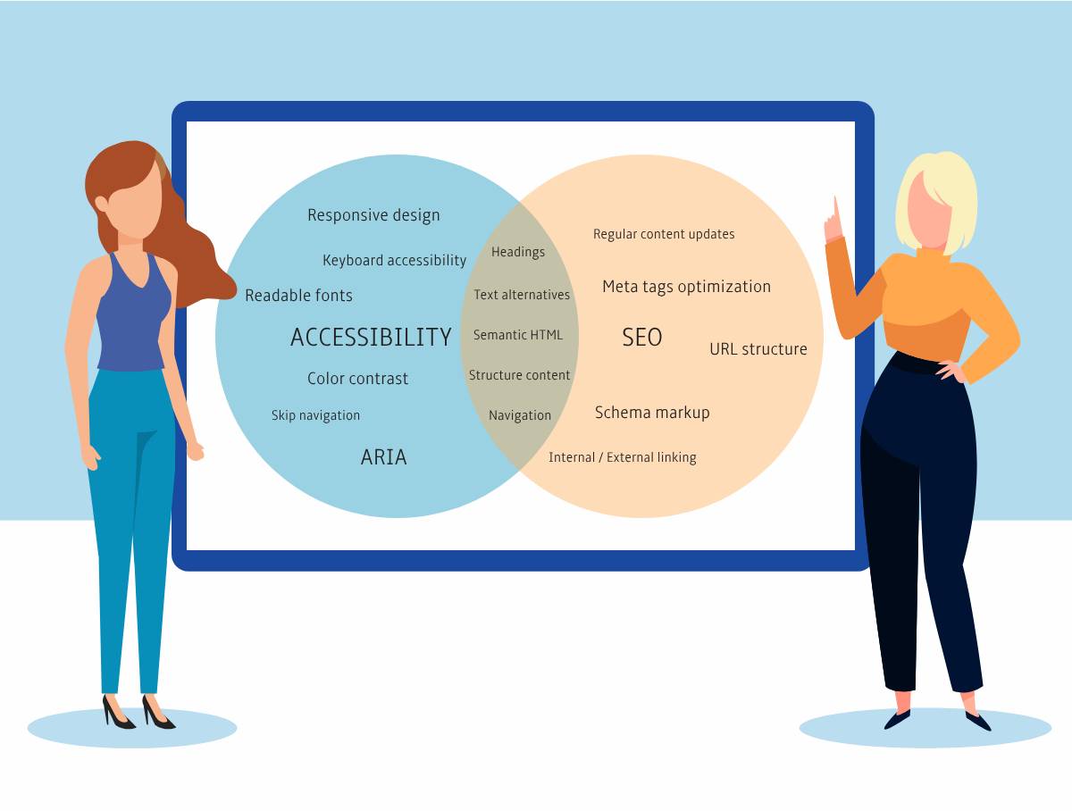
Text Alternatives: Missing Information
Here’s a common oversight: forgetting to provide text descriptions for carousel images. It’s not just a missed opportunity to inform your audience; it also affects your SEO game. Text alternatives convey the image’s information to users who can’t see the images or when they fail to load. Plus, search engines rely on these text descriptions to understand the content of your images.
How to Make It Better
Never skip adding text descriptions to your carousel images. These descriptions are invaluable for screen reader users and give your SEO a boost, improving your website’s visibility. Read “How to get your image to do more” to put your images to work.
No Keyboard Functionality: Not Everyone Uses a Mouse
Remember, not everyone can navigate using a mouse. Some users rely solely on their keyboards to navigate websites. That means your carousel should be keyboard-friendly too.
How to Make It Better
At the very least, ensure that people can use the TAB key to reach your navigation buttons. Ideally, go the extra mile and let users navigate through your carousel using the left and right arrow keys. Accessibility means welcoming all, and this step ensures inclusivity.
In Conclusion
By implementing these accessibility improvements, you’re not only adhering to web standards but also elevating the user experience for a diverse audience. Your website will become more inclusive, welcoming, and user-friendly. Ultimately, the goal of creating accessible image carousels is to ensure that everyone, regardless of their abilities or tools, can enjoy and engage with your content. So, as you design and update your website, remember to keep accessibility in mind – it’s a win-win for both you and your cherished visitors.