The essential guide to inclusive font
Fonts
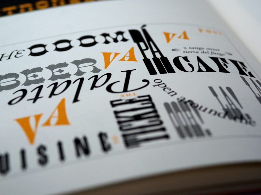
Choosing the right font can be overwhelming, but with this easy guide, you’re armed with all the knowledge you’ll need.
What to look for?
Take a look that your font families and ask yourself the following:
- Are your letters/words recognizable?
- can you tell the difference between I (capital ‘eye’), i (lowercase ‘eye’), l (lowercase ‘el’), and 1 (number one)
- If you use a cursive style, can you understand each letter?
- Some cursive fonts will close the loop on a C to make it look like an O. Some will make it hard to tell the difference between an r and n, so it ends up looking like an m
- Does each line have enough room or do the letters overlap each other from one line to the next?
The video below features someone writing in calligraphy, “less is more”
Font family
Accessible font
On this blog, I use a font called Raleway because it’s very easy to tell one letter from the next
Inaccessible font
However, even any font can become inaccessible if the individual letters do not have enough space
Accessible font
Keep your choice of font simple
- Use san serif fonts (they are safer fonts)
- For those that don’t know, san serif means any letters that don’t have (or sans) extended features called serifs
Inaccessible font
Don’t use ligatures
- Not only can they confuse your users, but they also confuse screen readers and web crawlers
- A ligature is when you join 2 or more letters to make a new single glyph

Font size
Accessible font
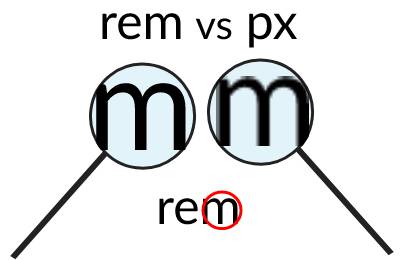
Consider relative measurements
- Using relative measurements, such as rems and percentages, allows the text to be adaptive
- When a user zooms in on the page, the letter keep their crisp look
Inaccessible font
Avoid using fixed measurements
- Using a fixed measurement such as pixels makes the letters look pixelated when the user zooms in
- From the image below, you can see loses its crispness when zoomed in
Font color
It’s not just the font you choose, but also how you use it. The colors you choose can make it hard to read. Let’s make sure your text can be read by most of your customers.
- The ratio you need to meet is 4.5:1
- You could get away with more flexible criteria for large text
- Text larger than 18.66 px & bold or 24px only needs to meet a 3:1 ratio
- However, I recommend focusing on 4.5:1 ratio so you don’t have to mentally remember which color is applicable for only large text. Keep it simple
- To test your color contrast, use this free tool from webaim
- Test your text color against all your backgrounds
- most web design systems offer multiple backgrounds, such as light and dark backgrounds, so make sure to test all your backgrounds
Text on background
Accessible font
| The text here is #222222 on #f5f5f5 background; which gives us a ratio of 14.59:1 |
Inaccessible font
| The text here is #222222 on #777777 background; which gives us a ratio of 3.55:1 |
Accessible font

Text over an
area where it
can be read
An example of how you can add text over an image
Inaccessible font

Dark text over a dark irregular background makes it hard to read
An example of hard-to-read text over an irregular background
Text in buttons
Since buttons are a huge part of any website, we really want to test them thoroughly. But don’t stop at the default state; test all states, including focus! To help understand this point, we’ll use the buttons on this site as an example. Good news! The focus border only needs to meet the 3:1 ratio.
| Button | Text color | Background | Border color | Color contrast |
|---|---|---|---|---|
| Default state | #383737 | Transparent | #383737 | 11.86:1 (Passed) |
| Hover state | #FFFFFF | #4D4D4D | #383737 | 8.45:1 (Passed) |
| Active state | #FFFFFF | #4D4D4D | #383737 | 8.45:1 (Passed) |
| Focus state | #383737 | Transparent | #383737 | 11.86:1 (Passed) |
| Focus state | Page background: #FFFFFF | Focus border: #0F4DC9 | 7.17:1 (Passed) |
What about disabled buttons?
I have great news! When it comes to the text in a disabled button, you don’t need to worry about color contrast. Need the proof from WCAG?
Text or images of text that are part of an inactive user interface component, that are pure decoration, that are not visible to anyone, or that are part of a picture that contains significant other visual content, have no contrast requirement.
Understanding Success Criterion 1.4.3: Contrast (Minimum)