Unlocking the power of the focus state

Welcome to our discussion on the often-overlooked hero of web accessibility: the focus state! Today, we’re talking about why it’s so important to have and how it makes your website welcoming to everyone.
What’s a focus state?
Let’s begin with the basics: what exactly is a focus state? Simply put, it’s a visual cue indicating which interactive element on your screen is currently selected. Imagine you’re on a website, and you can move around using just your keyboard. When a user hits the TAB key, the focus seamlessly shifts to the next interactive element, facilitating smooth interaction. Conversely, SHIFT + TAB moves the focus backward.
It’s like a spotlight that shows you which part of the website you’re on. It helps you know what you’re about to click or interact with.
Why it matters
It helps everyone use your website
The most common customers dependent on a focus state include:
- People who use screen readers – These folks rely on screen readers to navigate the web, and they’re not just individuals who are blind. People with low vision or conditions like dyslexia also use screen readers to access online content. Screen readers are mainly controlled through keyboard inputs.
- People with limited mobility – This includes individuals who may struggle with fine motor skills, making it challenging to use a mouse. They might use tools like mouth sticks to type or switches that mimic keyboard functions for navigation.
It’s the law
Web Content Accessibility Guidelines (WCAG) has a number of requirements, and one of them says your website needs it visible. WCAG’s Success Criterion 2.4.7 requires the appearance of a “focus visible” state (Success Criterion 2.4.7) to ensure an inclusive website. It’s not just a good idea; it’s the law!
How to make a good focus state
Here are some simple rules to follow:
- Visible Outline: Ensure the outline is at least 2 pixels thick for clarity.
- Contrast Ratio: The color should have a contrast ratio of at least 3:1 between the outline’s color and the color of the background it’s on.
- Big Enough to See: Your interactive element’s focus should be at least 24 by 24 pixels.
What gets focused?
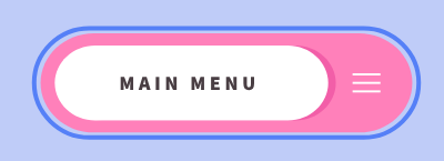
Any clickable thing on your website should have it. From links and buttons to form inputs and dropdown menus, inclusivity means leaving no element overlooked.
Keep things in order
As your customers move around your website with the keyboard, make sure the focus moves logically from one thing to another. It should follow the order as it appears on the page.
What to watch out for
Here are a few things to avoid:
- Relying on default styles: Browser defaults may not always meet accessibility standards, so make sure the color you choose meets the requirements mentioned in How to make a good focus state.
- Incomplete focus: The focus outline should cover the whole interactive element, not just part of it or cut off in any way. (Top image)
- Don’t hide it: Make sure interactive elements are big enough or hidden so the focus state can be seen.
- Contrast issues: Check that the focus color against different backgrounds on your website. As mentioned in How to make a good focus state, you need at least 3:1 contrast. (Bottom image)

Conclusion
Follow these guidelines, and you’ll ensure your website provides an inclusive experience for every visitor. Together, let’s build a web where everyone feels seen and valued.